Duration: 2 weeks
Disclaimer: All product names, trademarks and registered trademarks are property of their respective owners. All company, product and service names are only for identification purposes.
However, as we started listing out each of the sections/subsections of the navigation, we noticed a lot of crossover and repetition in the site structure.
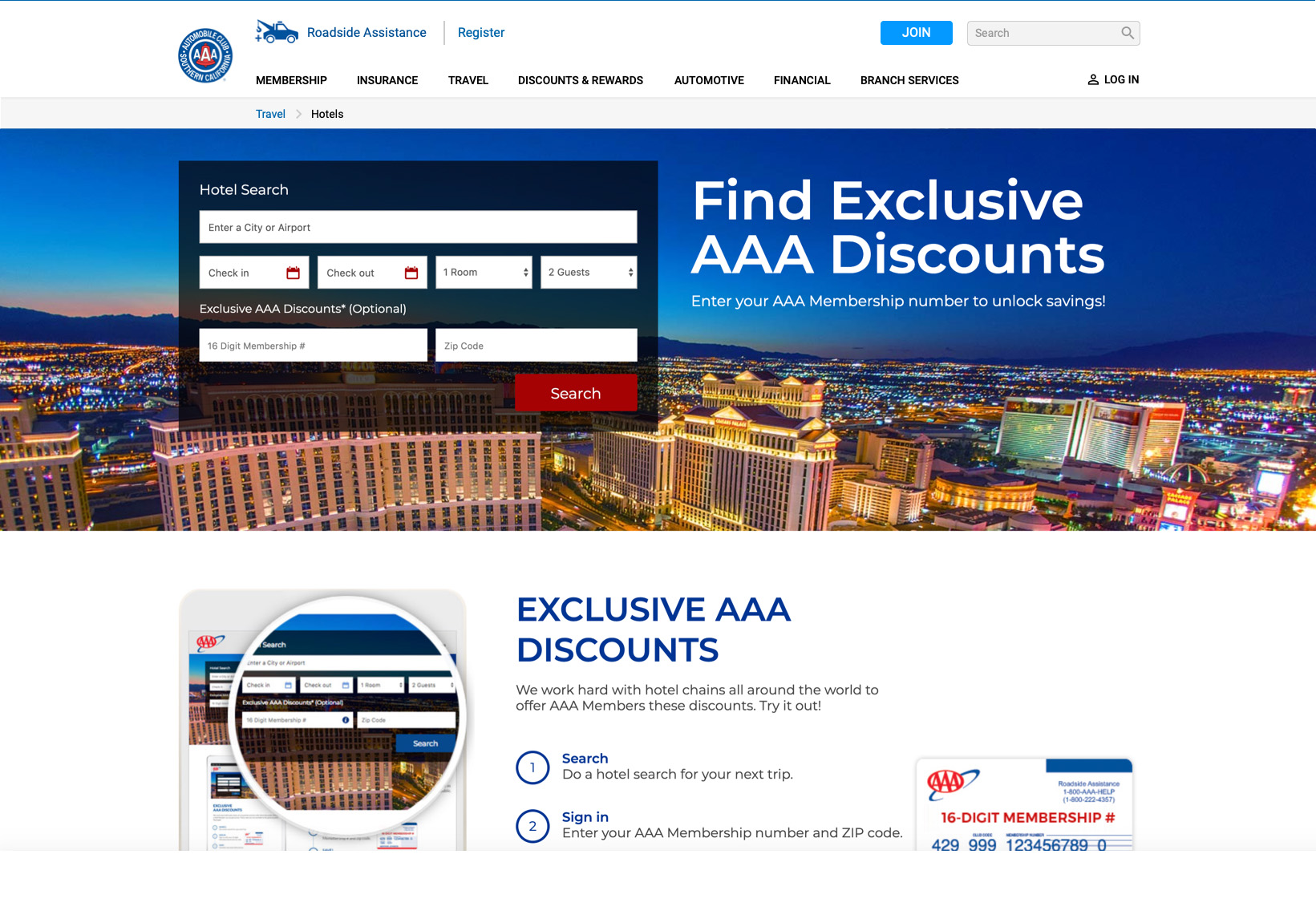
We also found that a number of navigational items immediately launched an external site tab: AAA-related but not part of the main site; or another affiliated site altogether. Also some navigational items were simply anchors to content somewhere down on a page of the main site.
Multiple logins, redundant links, anchor points to somewhere, and spawned external tabs become a frustrating experience to navigate through all that AAA has to offer.
There are subsections of the navigation that reference "Self Serve". The issue is that a website's primary function is "self serve" in that no one else is there doing it for you.
All this may be an effort to distinguish what you can do online ("self service") versus what's offered at their branch offices ("full service"), but the labeling is confusing.
There's also an entire section of the navigation devoted to "Self Serve" (highlighted above in light gray). This section simply repeats links within the "Self Serve" subsections.
Another issue is that links in "Self Serve" subsections are not as much "do" as they are "teach". Some links are simply anchor points to say more about what you CAN "do" if you did it yourself.
Although the labeling of subsections is nice when viewing the dropdown, the labels themselves can't be clicked on to go any main page of that subsection.
That wouldn't be a problem, except in a few instances, there are main pages that a user could browse.
In this example, when you arrive at the anchor point, the title is not only buried under the header, but it doesn't match what you've just clicked on.
There's something annoying about being dropped into the middle of a page without knowing where you are, and then forgetting why you clicked on it in the first place.
It's also annoying when the anchor points don't properly account for the fixed header, so the title is under the header and you have no idea what you're reading.
Granted, creating a single login point for four separate sites would be no small feat. But it would streamline the user's experience, not having to find then establish separate logins for Roadside Assistance membership vs. insurance policy holder vs. someone a AAA credit card holder.
There are no less than 4 links (not easily found) to a whole page devoted to downloading the AAA mobile app, along with a section at the bottom of the homepage.
But is it necessary when surfing the site on a laptop? Determining device breakpoints (screen widths) could automatically eliminate these from users who are not on their phone/tablet, introducing them only when certain breakpoints are reached.
Of course this is one interpretation of how it should be restructured.
We recommend immediately setting out to prototype this and perform usability testing to verify that a user could easier identify and perform the tasks the online services provide.
But it's easy to see — from a usability perspective — there is less clutter, easy points of entry to individual pages (no more anchors), and a deliniation between what is/was "self serve" and what are "branch services".
There are a number of points to appreciate about the simplicity and clean look:
Things to note are that the brand has been moved to the left (it's also slightly larger) decreasing the height of the masthead while, at the same time, opening up the space.
Also, in the second set of images, the revised Membership information architecture is shown, minus redundant links, and Branch Services brought to the main navigation.
The internal marketing block was retained in the navigation from the existing site.
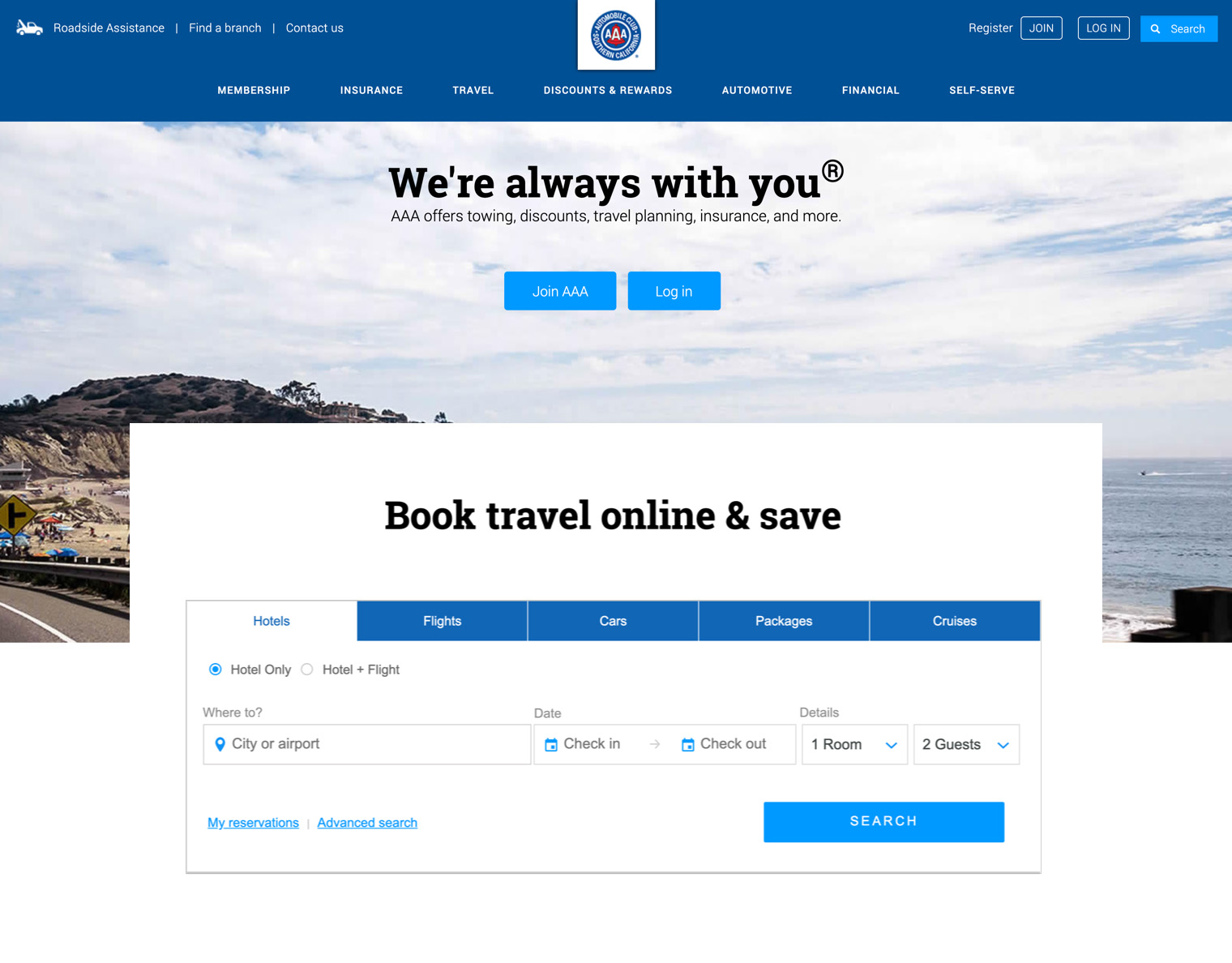
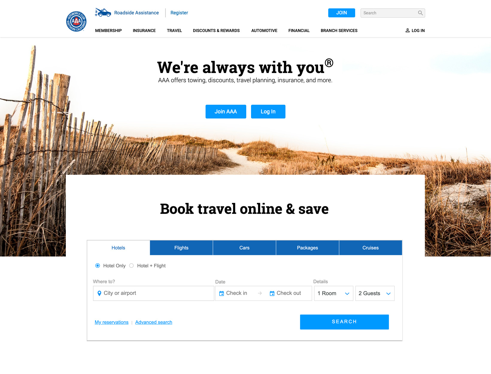
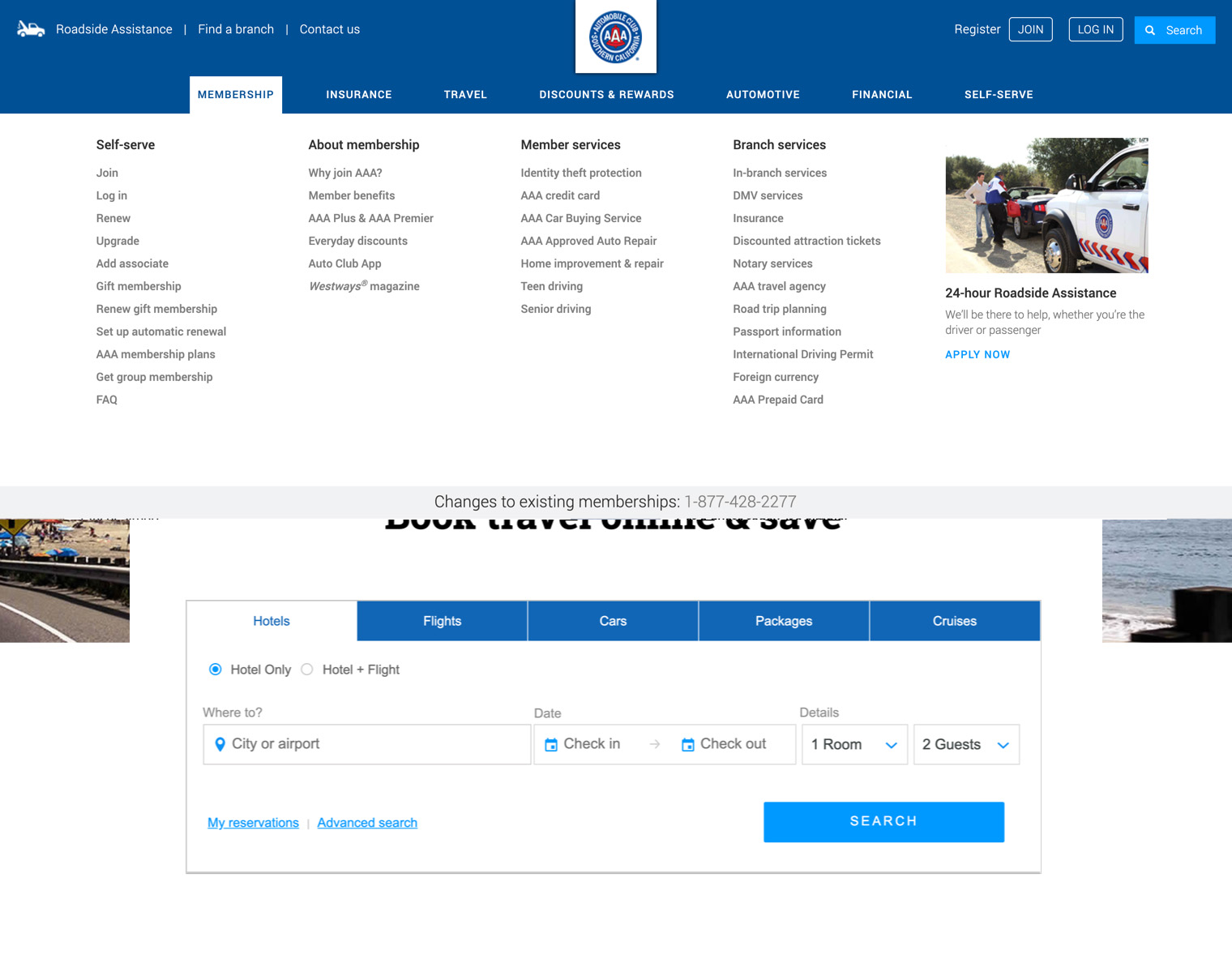
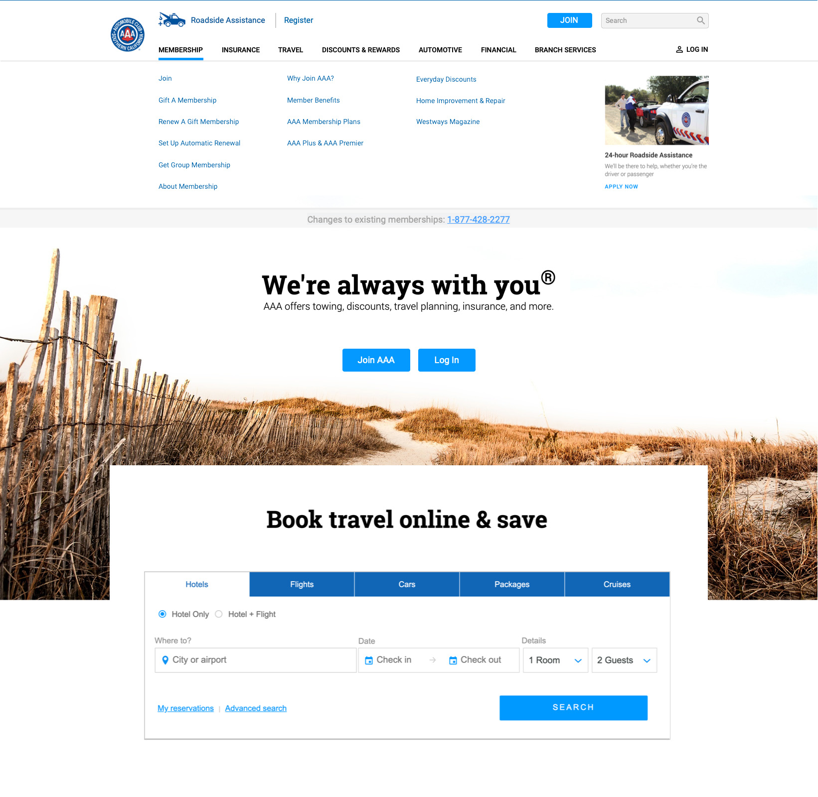
Note the branding could actually go larger with minimal adjustment to the Calls-to-Action or navigation to the right.
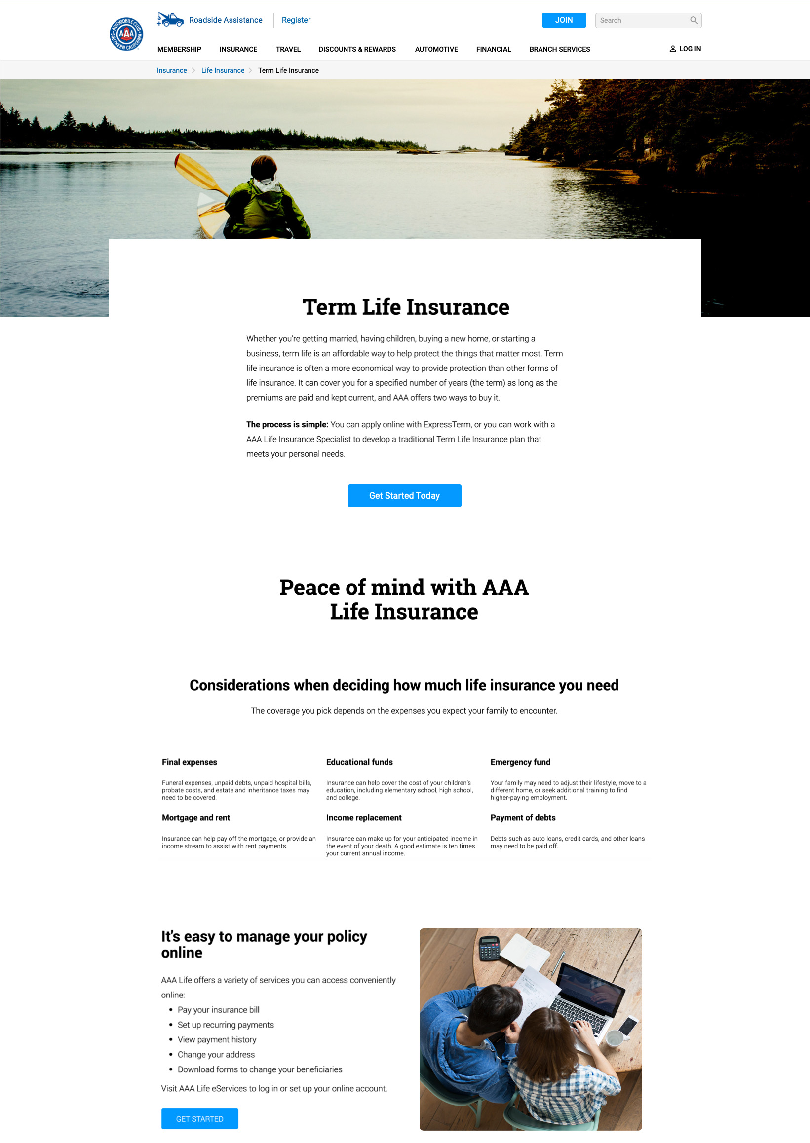
Using a fixed header with a loaded iframe below it would allow the user to interact with the external site content, prevent spawning tabs, and maintain consistent navigation to the rest of the site.
Some tracking of the user's browser history may be necessary to provide a means for them to use their Back button (still the most used button on the web), but it will make for a quicker engagement and less confusion.
A quick read revealed the business and user benefits: combining MFA and SSO represents the next evolution of online fraud protection and identity intelligence; one that can easily be strengthened by other security measures such as behavioral monitoring and analytics.
And while the use of MFA adds to login security, it could also fill gaps or lapses in account information by verifying/updating current points of contact such as phone number, email, etc.
Below is a flow process showing how SSO Authentication can provide a single point of sign in, simplifying the customer experience as well as reducing database administration costs.
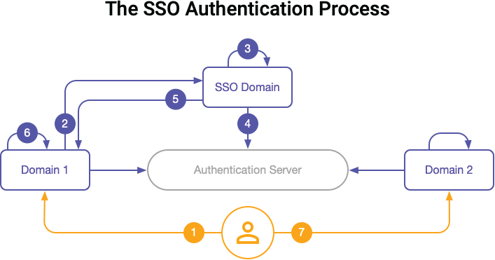
A revised login incorporating these above processes can reduce the redundant logins/access users experience.
This exercise really only addresses the "external" workings of the site. There are still numerous issues to address in terms of the consistency of account management. For the sake of AAA's IP, we won't expound.
There are benefits to creating a simpler experience for the user. The average user may only sift through so many lists to find what they're looking for before having to contact someone for help.
As call center costs will only increase, it makes sense to maintain simple navigation, and establish easy-to-use interactions that make the user's experience more satisfying.