Client: Milken Family Foundation
Role: Lead Designer, Frontend Development
Duration: 6 months
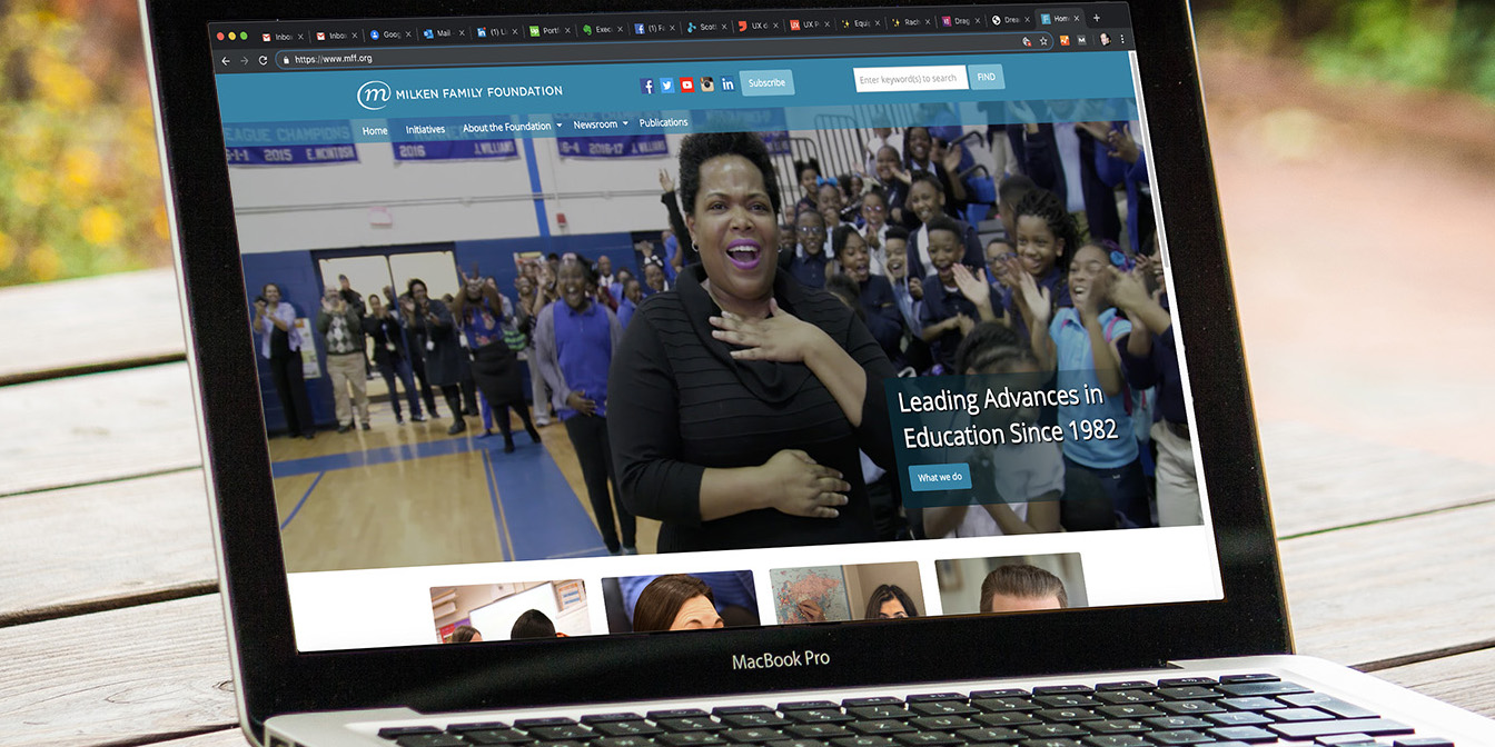
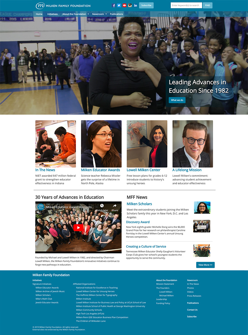
The main challenge was that the Foundation branding contained only one color, which the organization wanted to maintain across all aspects of the redesign. This meant the site would use only tonal values of the color to express everything from navigational menus to links to buttons to backgrounds.
Also, it was established that the use of fonts could only match the typography of the branding.
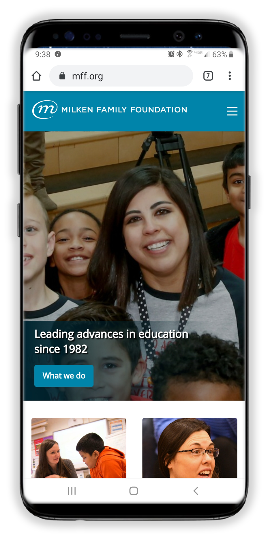
In addition, the site was to be completely redesigned and all development done in a more current framework to support "mobile first" viewing on multiple devices, and "shorthand" CSS codes added for non-technical editors to customize content.
Since the Foundation is a non-profit with a large endowment, there were no sales or marketing that occured on the site platform; although there was an interest to stay current with other non-profits that were in education or other areas they supported.
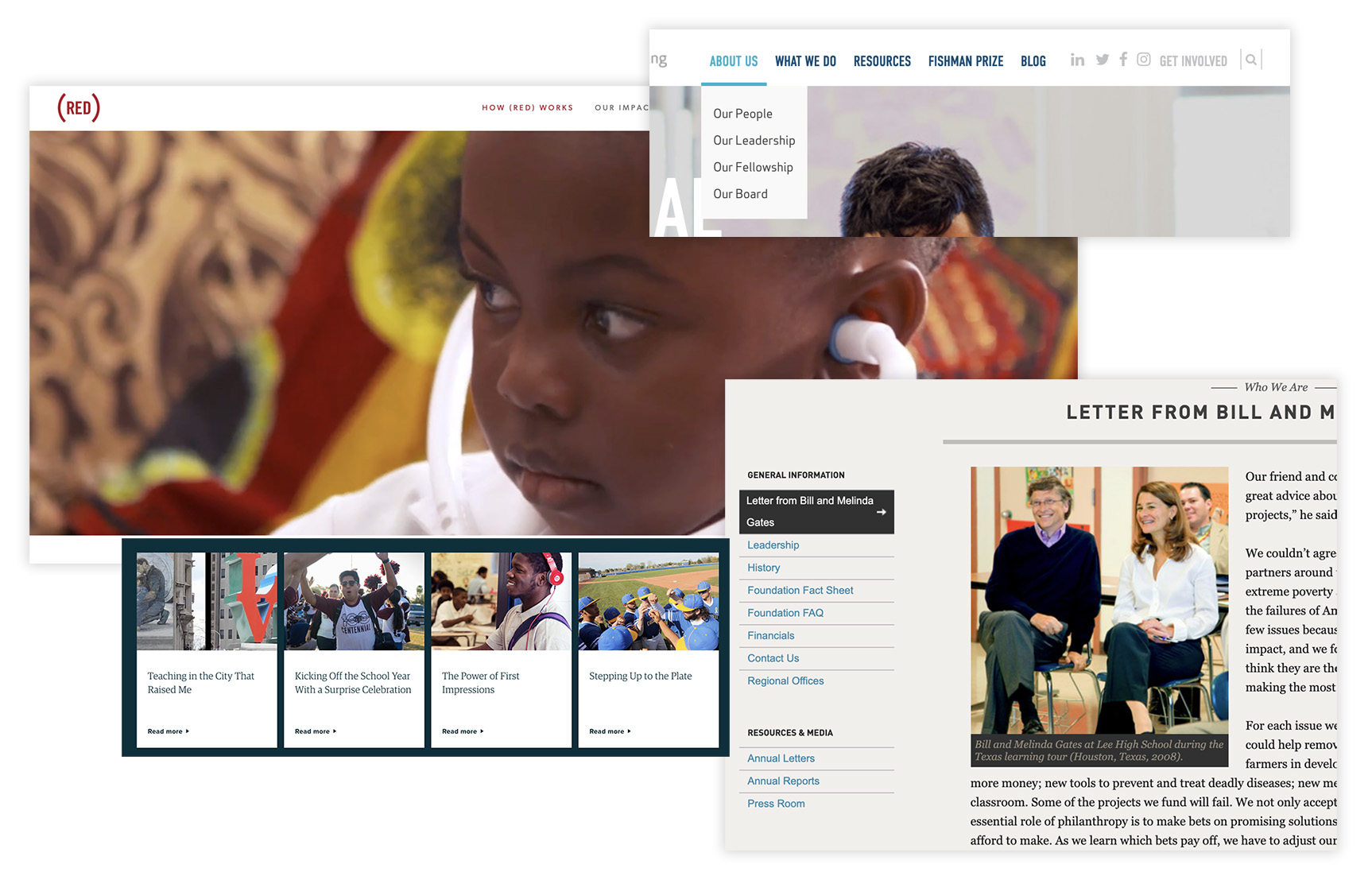
These sites were identified to emulate in terms of layout, and functionality:

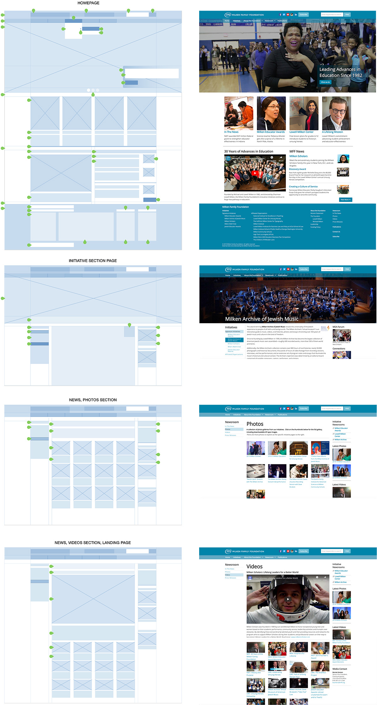
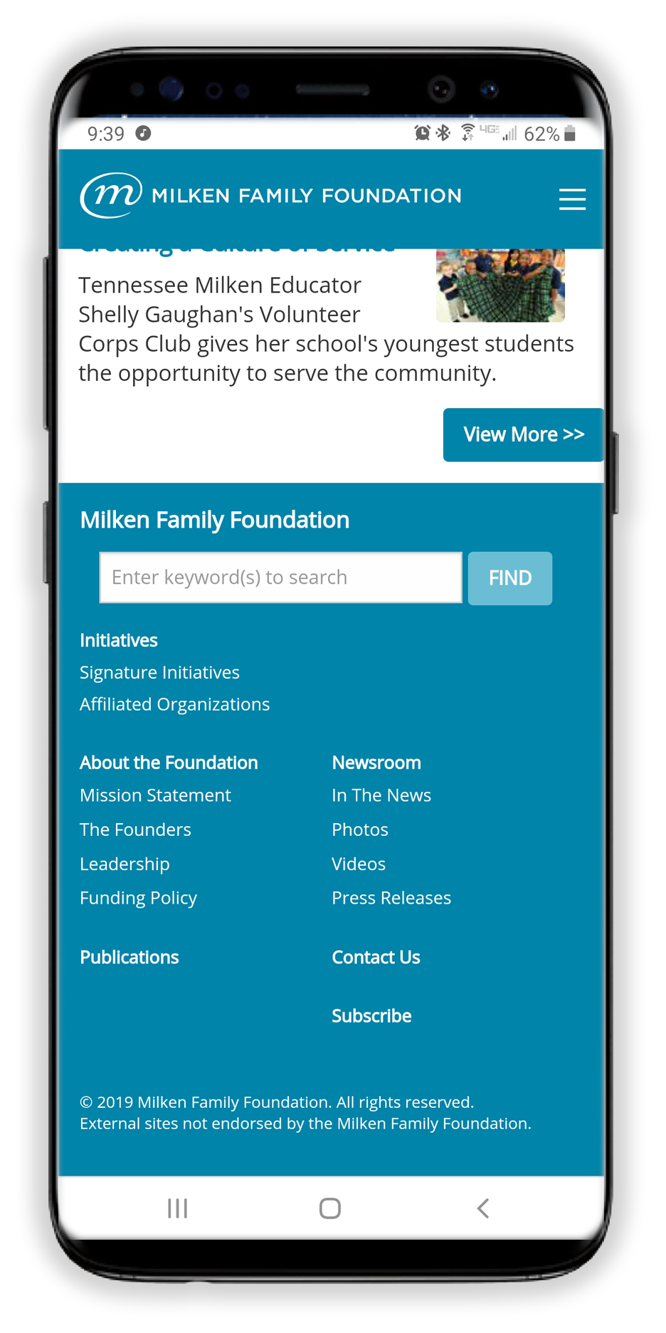
First the basic site structure was mapped out, and specific areas of the site addressed for content that would be expanded and/or aggregated. One of the Founders of the organization was to be given a specific section of his own, and Publications would become a single scrolling page.
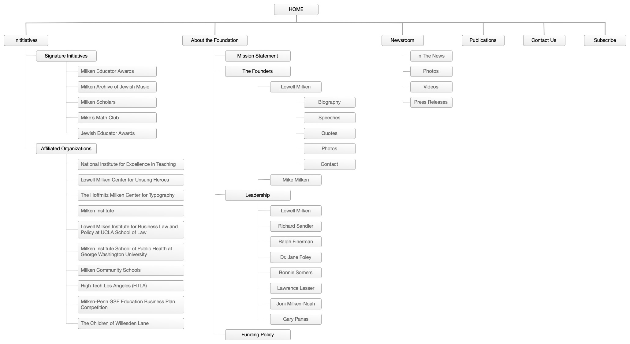
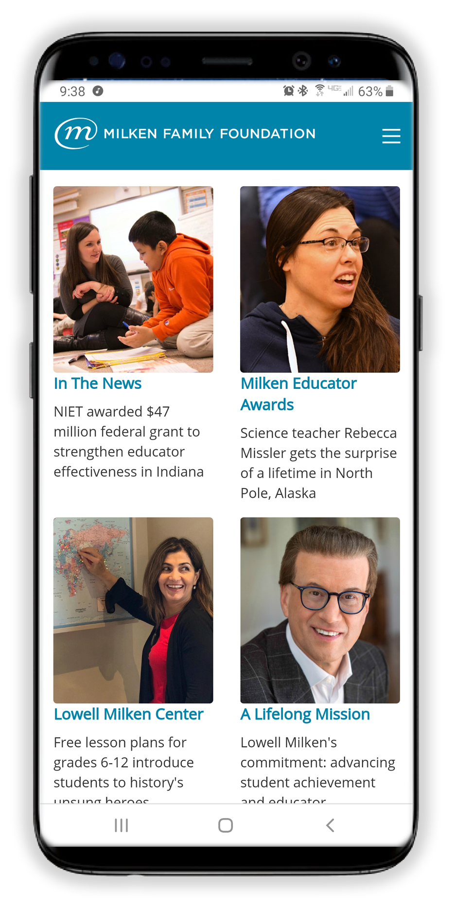
Although the site structure isn't complex, the Newsroom section became an aggregate of three other affiliated sites' content. The result is a few hundred of the most recent press releases, videos and photos, and "in the news" items; all needing a way to navigate through them.
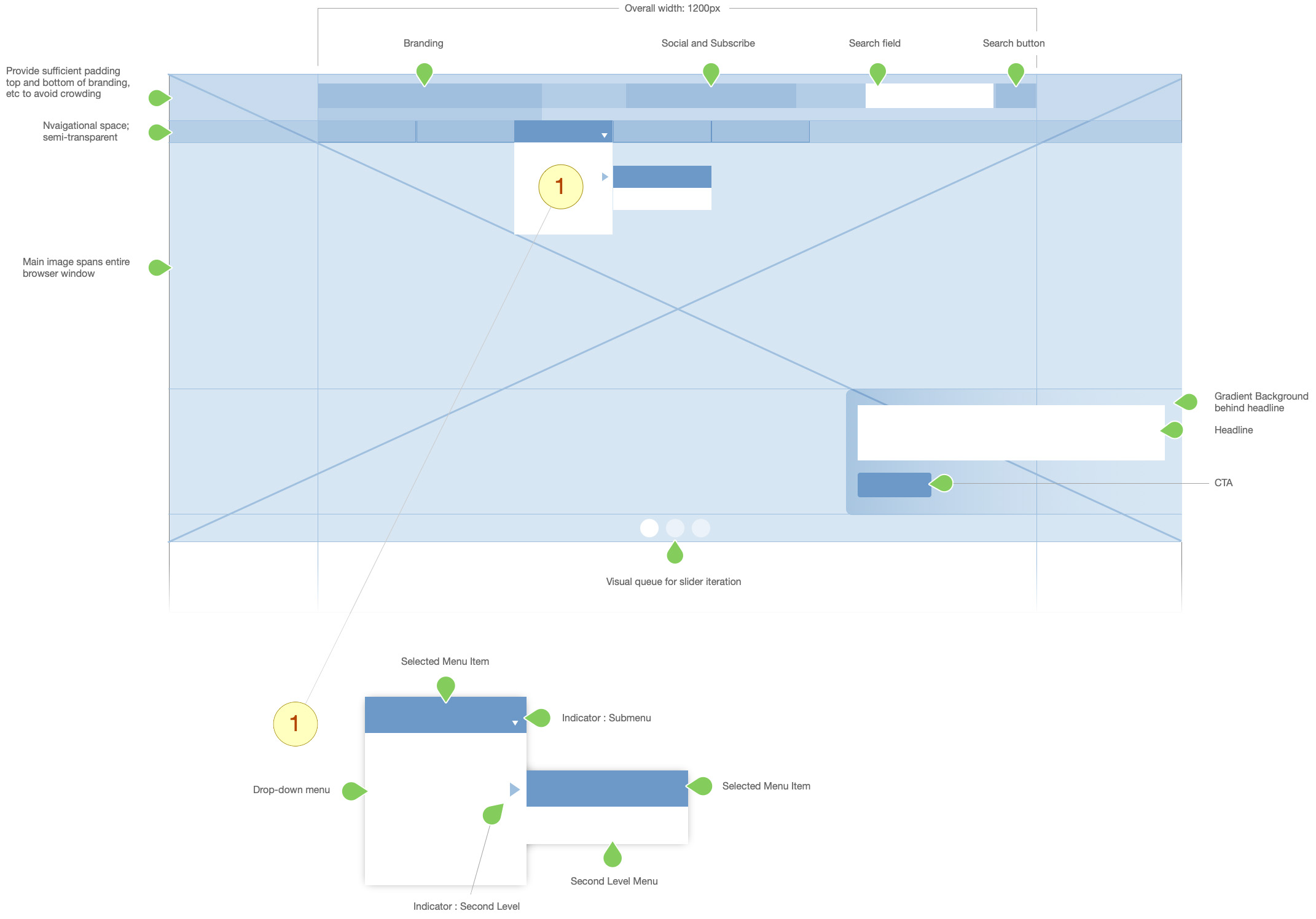
Hover State (Buttons, Links, CTAs)
Header, Footer, Sidebar : Level 2 : Selected, Links
Header Navigation
Masthead Buttons
Body Text, Headings
Separators, Horizontal Rules
Page, Body
font-family: 'Open Sans', sans-serif;
Bold, Italic
This is a paragraph. Lorem ipsum dolor sit amet, consectetur adipiscing elit, sed do eiusmod tempor incididunt ut labore et dolore magna aliqua. Ut enim ad minim veniam, quis nostrud exercitation ullamco laboris nisi ut aliquip ex ea commodo consequat.
| Masthead | Label |
HEX: #6bbdd4 RGBA: (0,132,169,1) |
| Hover | Label |
HEX: #005770 RGBA: (0,87,112,1) |
| CTA | Label |
HEX: #0084a9 RGBA: (0,132,169,1) |
| Hover | Label |
HEX: #005770 RGBA: (0,87,112,1) |
|||
| Top Level | Label |
HEX: #0084a9, 0.7 RGBA: (0,132,169,0.7) |
| Hover | Label |
HEX: #005770 RGBA: (0,87,112,1) |
| Side: Level 1 | Label |
HEX: #ffffff RGBA: (201,227,240,1) |
| Selected | Label |
HEX: #c9e3f0 RGBA: (201,227,240,1) |
| Level 2 | Label |
HEX: #0084a9 RGBA: (0,132,169,1) |
| Mobile Nav | Label |
HEX: #005770 RGBA: (0,87,112,1) |
After testing the complete developed site it was determined that, based on the monochromatic color scheme, the left side navigation of section pages didn't appear to change color on the hover state.
After discussion, a complementary link color on the hover state was agreed to, allowing a (desktop) user to feel more of an intent behind clicking on the link(s).
The organization was pleased with the work performed and, although worried about a reduction in traffic due to most of their initiatives' content moving off to other sites, maintained steady traffic, and even increased in the next 12 months.
Creating a custom CMS also allowed them to perform much of the maintenance and produce editorial content without need for technical assistance or formally trained individuals.
In hindsight, the monochromatic color scheme allowed the beautiful images and video to become even more engaging to the experience. The straightforward navigation and open space produced less noise on the page(s) and provided a seemless way to browse through pages.
There are some needs still to address in the lack of proper spacing in left side nav labeling, and a refresh of the social media icons and Subscribe modal would bring the site a bit more up-to-date. Also the occasionally awkward break from one row of photos/videos to another make it feel a bit unfinished.
Overall, though, the client was/is happy with the results. That's success.