Client: AtomRain
Role: Lead Designer
Duration: 1 week
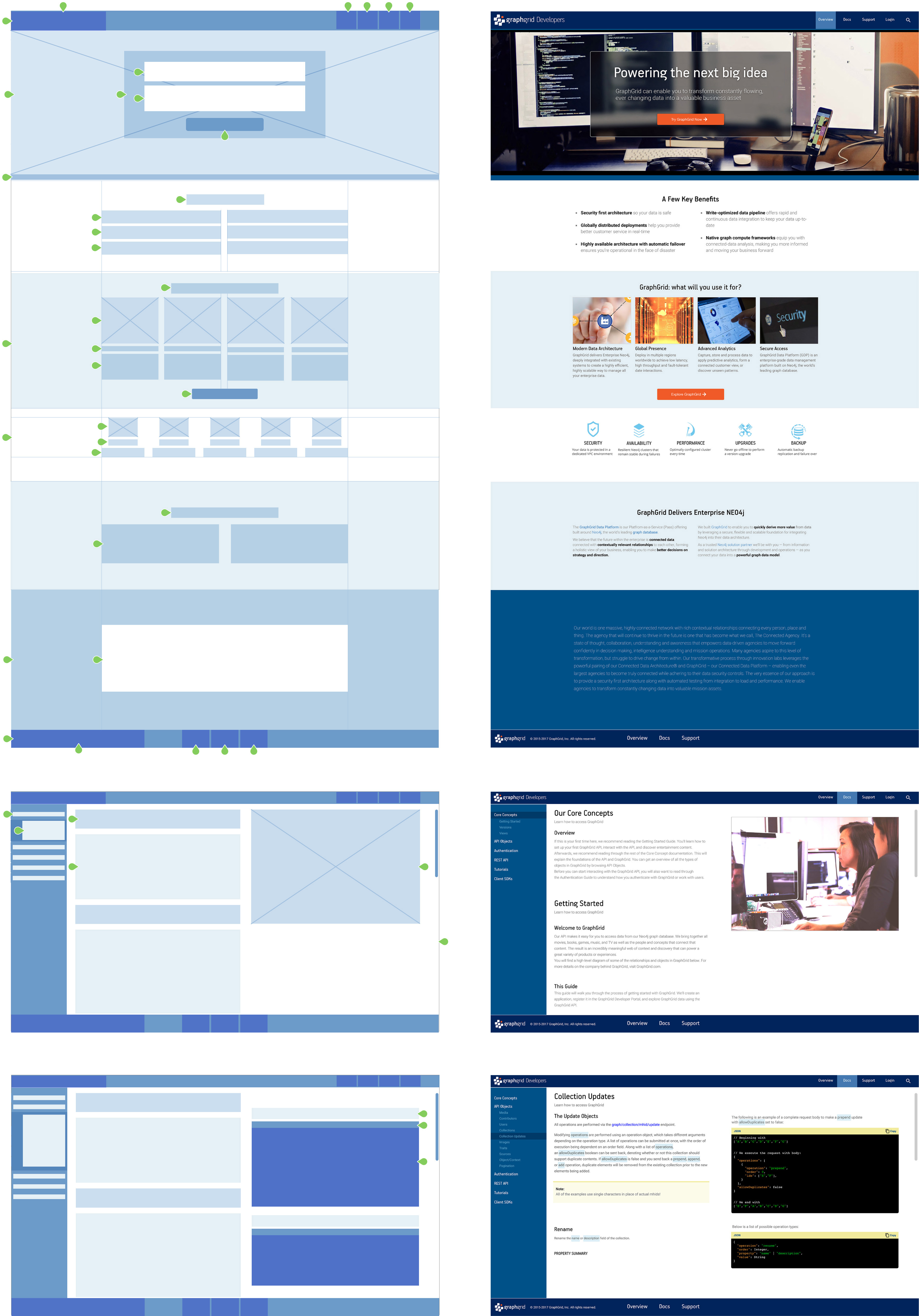
There had never been an online presence, so there was no established framework for a site. The audience is comprised of developers, engineers, data scientists and business intelligence analysts looking for resources to help them develop data visualization tools and adminstrate large data lakes.
The overall design was to function within the confines of a single browser window on a desktop/laptop device.
A fixed header, footer, and left side navigation would frame the overall experience.
The first level navigation categories of the left sidebar menu would navigate between pages of content, while secondary levels would scroll the page to predefined anchor points.
Links within the content pages would initiate content next to (right of) the scroll.

Header, Footer
Resources, First Level Highlight
Homepage: Concluding Statement Background
Resources: Side Navigation Background
Open Text Background
Resources: Terms Background
Homepage graphics
Resources: Example Header, Note Top Border
Resources: Example Header, Note Top Border
Headings
Body Text: Homepage, Resources
Navigational Links
Resources: First Level links
Homepage: Main title, Subheading, Final Text Statement
Page
Body
Buttons, CTAs
Homepage and Secondary Level links
Resources: Body Content Links
font-family: 'Roboto', sans-serif;
Bold, Italic
This is a paragraph. Lorem ipsum dolor sit amet, consectetur adipiscing elit, sed do eiusmod tempor incididunt ut labore et dolore magna aliqua. Ut enim ad minim veniam, quis nostrud exercitation ullamco laboris nisi ut aliquip ex ea commodo consequat.
font-family: 'Roboto Condensed', sans-serif;
Bold, Italic
This is a paragraph. Lorem ipsum dolor sit amet, consectetur adipiscing elit, sed do eiusmod tempor incididunt ut labore et dolore magna aliqua. Ut enim ad minim veniam, quis nostrud exercitation ullamco laboris nisi ut aliquip ex ea commodo consequat.
The design concepts were handed off to the development team, and they are still in process. Prototyping might reveal shortcomings of visual queues of the overall design, however functionality is well-established and should perform as it should.
We look forward to seeing the completed project and having a chance to perform usability testing and make any recommendations for needed refinements.
